Impressions of a First Timer at UX Scotland
This was originally published in 2019 on Medium and has been updated with changed links as well as links to video talks.
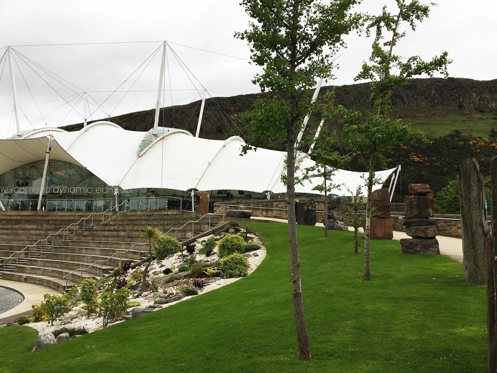
Dynamic Earth, the venue for UX Scotland in Edinburgh
While trawling the internet for lists of design conferences late last year I stumbled upon the UX Scotland conference in Edinburgh. Through luck, I was going to be in town and the program looked like an excellent opportunity to dive into discussions about current practice. Here are some sessions that still resonate with me a couple of weeks after attending UX Scotland.
Day 1 Keynote – Opti-pessimism: Design, AI, and Our Uncertain Future
Keynote Speaker: Cheryl Platz, Principal Designer and Owner, Ideaplatz —@funnygodmother
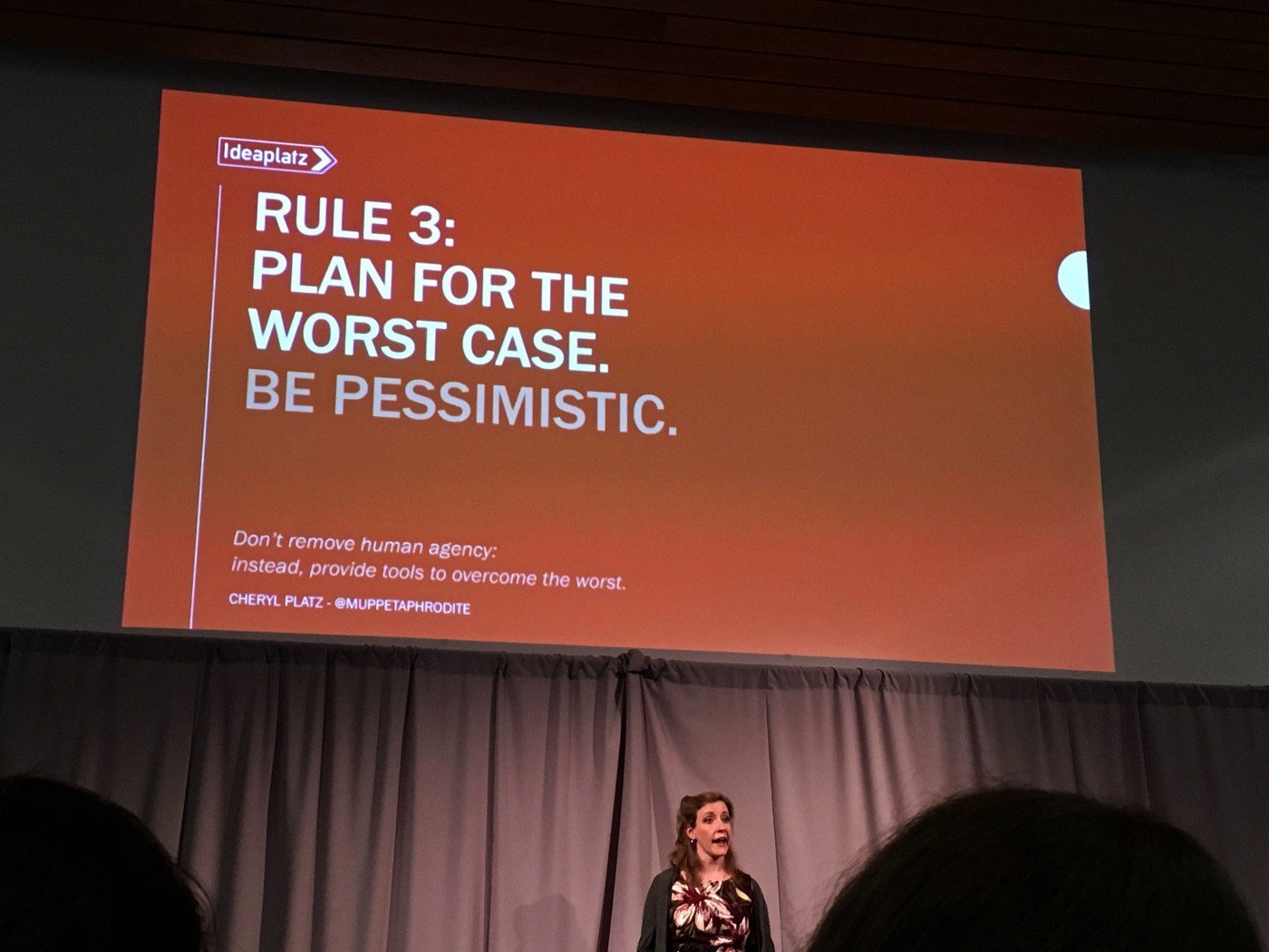
Cheryl Platz kicked off Day 1 with some good storytelling involving escaping an elephant while on safari. The core takeaway from Platz’s session is to truly design for humans: embrace optimism but understand that pessimism and edge cases are powerful tools to evaluate the veracity of one’s ideas.
User experience design and research used to focus solely on the “happy path” but we’ve not fully taken onboard the consequences of unchecked optimism and not looking underneath all the rocks. We’ve all seen what happens when scientists never assume their inventions will turn against them, but they (and we) just keep plowing ahead like nothing will ever go awry.
Hope for the best, plan for the worst case scenario. Slide © Cheryl Platz
By accounting for a multitude of people normally outside the project scope, bad actors, and other external factors over which we may not have control, we can future-proof design solutions a little bit more. This isn’t all just pessimism though. Platz asks the question, what if your users actually really love your product and it’s enormously successful? Have you considered how it will scale, how you can support the experience and build elasticity into the customer life cycle?
This talk was oddly comforting as I seem to be a natural born pessimist and can lean towards designing for “edge cases” regularly.
Why the quotation marks? As a person who’s a member of underrepresented groups in tech and in the places where these conversations take place, I tend to design with “others” in mind naturally. I can’t cover everybody but I ask “What if?” on a regular basis.
Have a look at Cheryl Platz’s slides and download them here. She also recently wrote an article on Medium expounding on the concept. Watch the video on Vimeo.
Machine Learning for Designers
Speaker: Memi Beltrame, Less A Mess — @bratwurstkomet
Without knowing it, I was actually chatting at lunch with Beltrame before his session saying how much I was looking forward to sitting in on it. Unsurprisingly, Beltrame’s session was illuminating, technical, and informative without being an onslaught of information. He comprehensively explained the difference between AI and Machine Learning (ML); the patterns used to train AI in image and language recognition; and he finished by posing some key ethical questions.
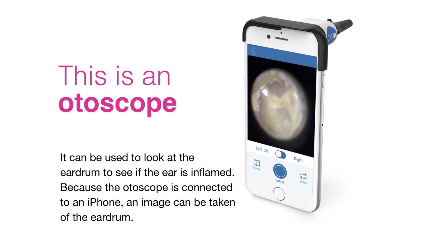
Combining app + medical device to create a new version of an otoscope. Slide © Memi Beltrame
Straight off the bat, he described where AI integrates into the loop of service design by using the example of a medical app used in conjunction with a small device that attaches to mobile phones. Together along with other digital components, creates an otoscope — a device to diagnose inner ear illnesses.
Service design loop for a physical object and a digital interaction. Slide © Memi Beltrame
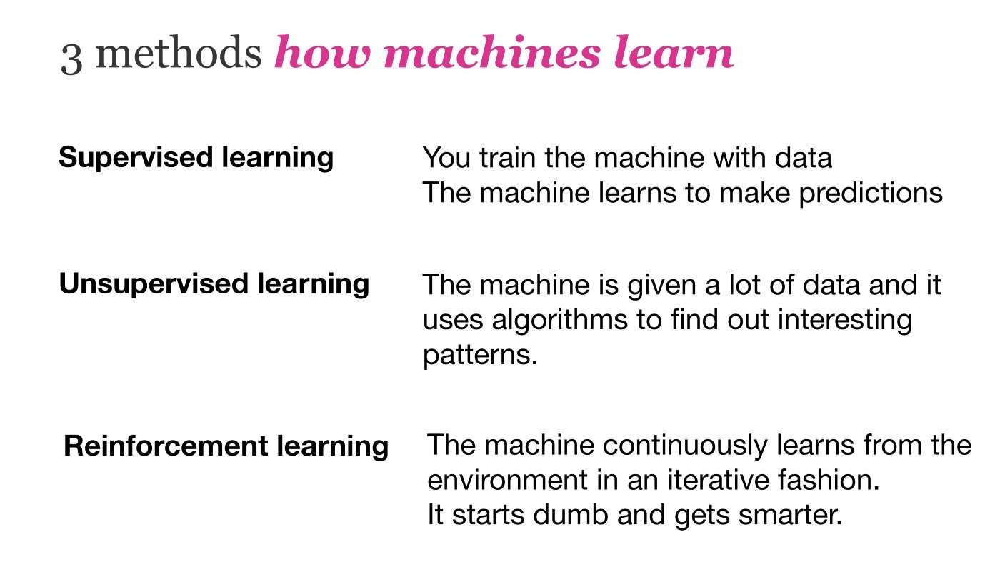
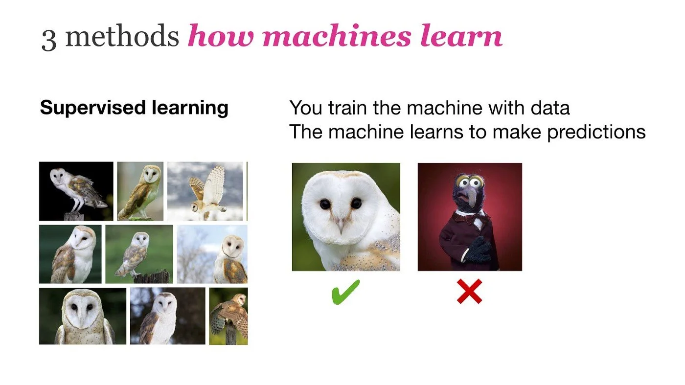
The 3 methods of training machines to learrn. Slide © Memi Beltrame
Is Gonzo an owl? Most likely not. Slide © Memi Beltrame
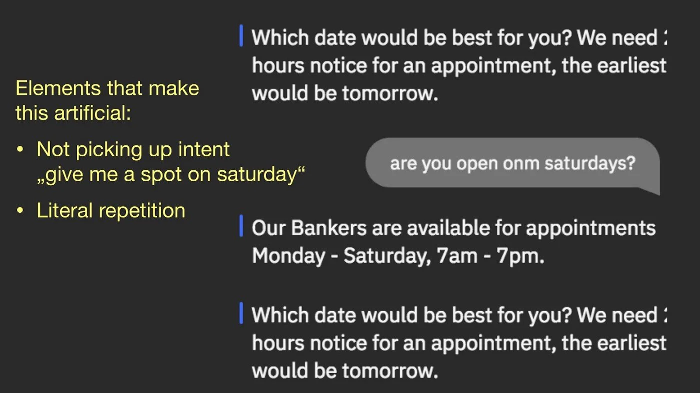
Artificial interactions are jarring for human participants. Slide © Memi Beltrame
Where designers can find their place in the arena of AI is in translating interactions to be more natural and reduce friction or weirdness when dealing with robots. The patterns of interactions can still feel like a like loop and unnatural.
Our work can focus on training the conversational UI to ease people’s fears when interacting with AI.
Another area designers can intervene within the field of AI is to propel forward questions of ethics. Beltrame’s message was similar to Cheryl Platz’s keynote in that engineers and others in tech are creating but without considering the implications of their decisions and inherent biases.
Training ML with edge cases enables the program to recognize what does not match “the norm”. This itself is problematic because so much of the training is done from an anglophone perspective, not even just that of Western Europe.
When systems are designed with only anglophone needs considered, the rest of the world then becomes an “edge case”.
Download Beltrame’s excellent slides here. They’re chockful of useful information and easily digestible. Plus, they also made me appreciate the typeface Georgia again.
Watch the video here on Vimeo.
From Design to Large-Scale Execution: Reshaping a Territory
Speaker: Sylvie Daumal, WeDigitalGarden — @Lyoko4TW
What if you arrived at 10:00am in a ski resort in the French Alps, lugging all your equipment but you couldn’t check into your lodge until 5:00pm and no other place in the town would let you store your stuff?
Sylvie Daumal presented a case study of service design implemented by her design firm, WeDigitalGarden, and they tried to solve just this problem. Their focus was to help a ski town that had a problem accommodating patrons who arrive into town at 10:00am on the only bus with their equipment and luggage. Adding to the problem was none of the lodges would allow luggage storage before check-in and restaurant owners in town turned away people as well. Imagine being stranded in the middle of town with all your heavy equipment and it’s snowing!
To top it all off, because of its mountain terrain, to access different sections of town, people had to take underground tunnels and elevators to walk to different areas. This was a classic case of different players saying “Not my problem” and not acquiescing to address the problems their patrons were facing.
– photo credit WeDigital.Garden
The design team spent 3 months doing design sprints on the project, alternating between on-site design workshops/user research and in-office iterating. They would spend one week in the local ski resort town iterating and working with varied stakeholders or testing ideas with the public. Stakeholders ranged from local ski lodge owners to the police department, planning commission and the transportation department. The other three weeks of a month were spent back in their office prototyping and iterating on possible ideas to debut in town.
Their prototyping involved signage for the underground tunnel and elevator; potential bus routes on the busses; a live Wizard of Oz prototype in a public square advertising a service where skiers could rent a locker and use showers before checking into lodges, and much more. All the tests exceeded expectations of the design team as well as the government and private sector stakeholders. It helped break down the barriers to collaboration that previously existed in the town by allowing them to see how much better an experience their town could give its patrons.
The results of having two designers is not 2 times better but rather 4 times better. — Sylvie Daumal
The biggest takeaway from this session is: Always have a team of at least 2 UX designers because most forms of research tasks take at least two minds. Whether that’s interviews, workshops, etc. The results of having two designers is not 2 times better but rather 4 times better.
Another important point is that most people confuse experience with quality of service. Simply because the service is seemingly polite (or impolite) does not mean the experience itself was worth having or could not be improved.
WeDigital.Garden published the full case study about the project here.
Sharpening Our Research Craft
Speakers: Jessica Dilworth— @1essDilworth and Ben Cubbon — @B_Cubbon of OVO Energy
Medical, scientific or sociology researchers have likely learned how to gather data without getting in the way of the subject but UX designers and researchers may still be in the nascent stage of data gathering. This possibly applies to the scores of UX designers (including myself) who were not specifically trained in rigorous data collection in degree programs or job roles.
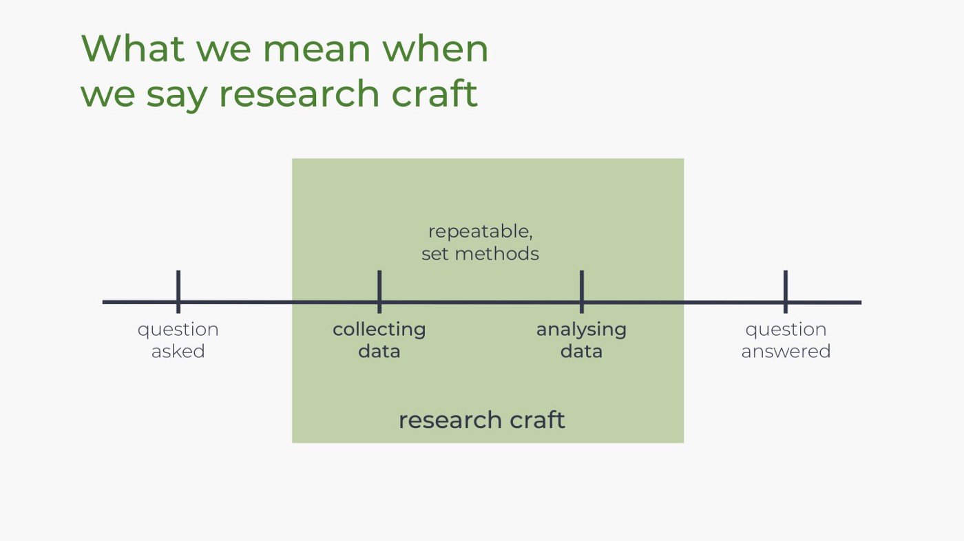
Research craft = a process or body of repeatable set methods of collecting and analyzing data. In most cases, I would call this a toolkit or toolbox that each person may hone according to the needs of their project and the way they themselves process information.
Research craft is process of collecting and analyzing data. Slide © OVO Energy design.
Research critiques were initially started by Jessica Dilworth and her critique was the first on their team. What prompted her to ask for critique was a user research phone interview session that didn’t go particularly well, with the participant being closed off. She had her colleagues listen to her interview and give feedback on her interview technique.
Via this critique session, she discovered that a speech habit where she would immediately say “Yeah” after receiving information from an interviewee. She unconsciously did this as a way to signal that she was receiving the information but it had the unintended effect of creating a bias for interviewees.
The interviewees would take this to mean a form of approval and to continue along a particular path or narrative that either wasn’t exactly conveying what the user experienced or it would shut down the conversation.
Have a basic structure when critiquing the research gathering process whether for a group critique or doing it along by yourself. Ground rules help keep the critique session on track while providing a sense of guidance for the end goals. That said, let it organically develop to give people space to create meaningful critique that can be taken and used later.
They shared a good resource for prompts for the research critique sessions to get you started — bit.ly/OVO_crit_prompts. You can also download their slides here & watch their video here.
I’ll definitely be looking to integrate this more in my next set of research on projects.
Put on Your Own Oxygen Mask Before Helping Others
Speaker: Anne Dhir, We Are Snook Ltd — @brightkaos
“We can’t design future experiences at the cost of present ones.” — Anne Dhir
Some projects centered around traumatic issues can be also be traumatic or triggering for the actual design and project team depending on their own personal experiences.
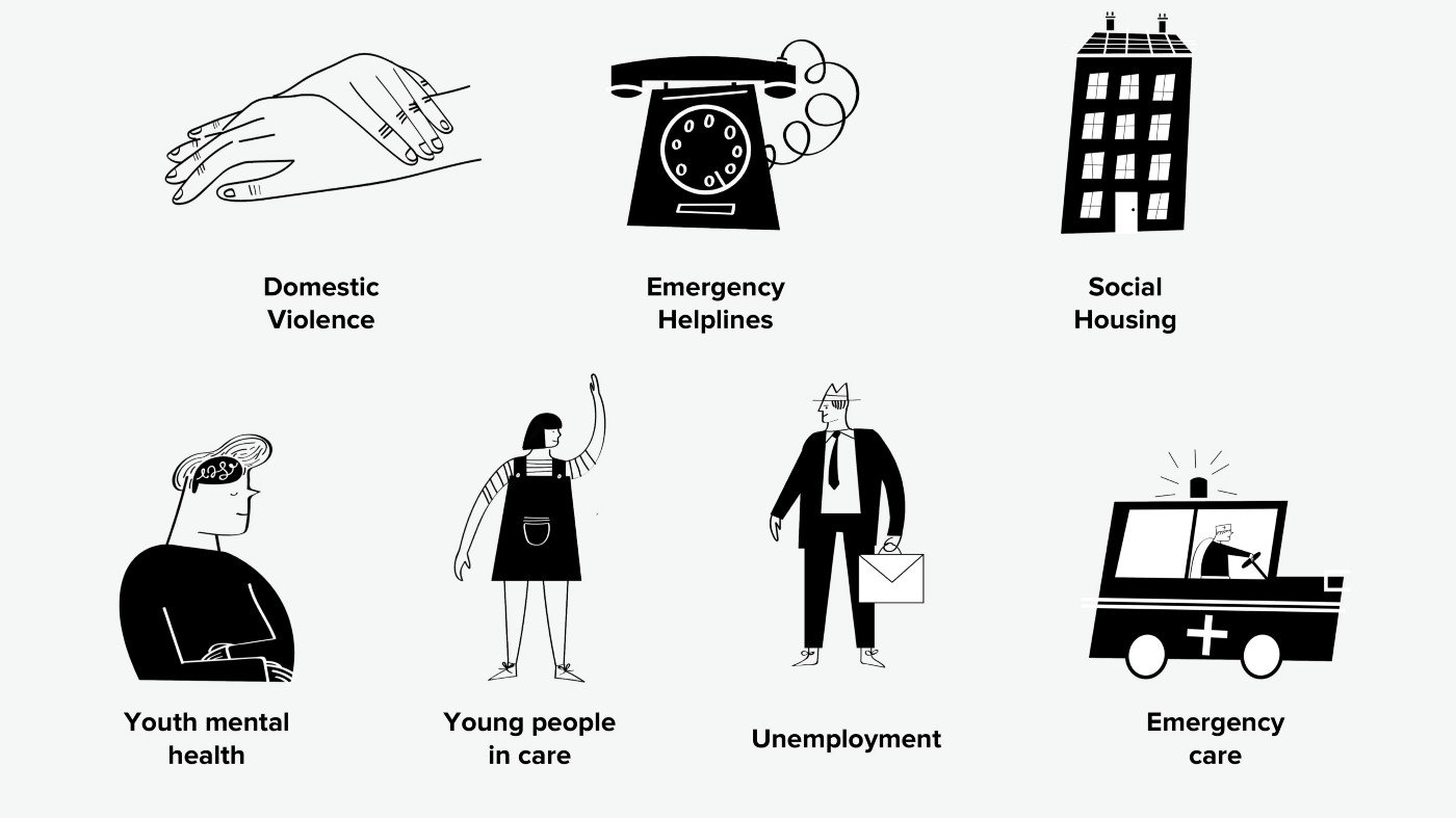
The research subject matters which may affect the mental health of your project team. Silde © We are Snook
Dhir’s thesis of her session was care for the team means care for the design project and research participants on the whole. It’s key to support your team that has to experience trauma either first or secondhand when working on projects. For example when working with populations experiencing domestic violence, police violence, housing or food insecurity, etc. — there can be an emotional distress experienced by the design or project team itself.
Guilt can also be a form of emotional distress that can take its toll. The team has no ability to directly influence the lives and problems of the interviewees such as complaining about government services like housing lotteries, etc. This does not prevent research participants from focusing their complaints, ire or sadness towards the researchers. The experience itself can be a distressing situation for the research team with a sense of helplessness but it’s up to the management and team to arm themselves to digest the content, process it and relay it back to the rest of the project team.
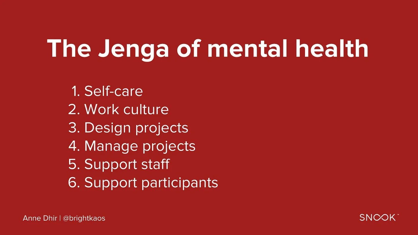
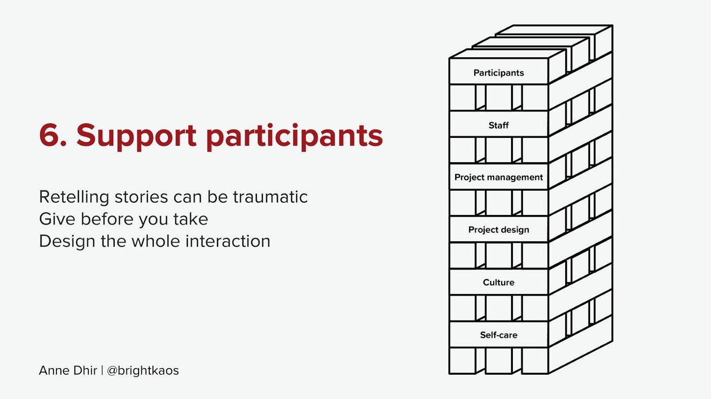
Jenga of Mental Health
A structure based on self-care becomes the foundation for mitigating the effects of difficult project subjects . Team members can do this by being aware of their strengths and limits and management being responsive to individuals’ needs. Weave empathy into the team and project management process in order to do good work and be present for the whole process.
Only then do we arrive at the last step of the Jenga puzzle on top: the actual support of participants in the project.
See all the slides here to see the outlines of each Jenga piece.
Read their white paper that dives deeper into well-being management in service design: http://bit.ly/mentalhealthdesign.
Conclusion – Well, that was lovely.
It’s been a long time since I’ve attended a design or even specifically a UX conference. The last conference I attended was the 2018 KIKK Festival in Namur, Belgium and before that was Reasons.to Brighton in 2017. It was time to get some fresh blood in my veins.
My main reasons for attending UX Scotland varied:
Re-find my people. Or at least one kind of my people, anyway. I’ve been working with a lot of non-UX people lately and want to re-immerse myself in the industry to cut through to the salient points being discussed.
Update industry knowledge. There’s been a lot of UX chatter in the last couple of years with a chunk of it sounding like noise. My goal is to catch the useful parts and use those as a springboard for more intense learning.
Acquaint myself with the UX field and community in Scotland. I’m moving over here blind and want to understand what moves the practitioners in this part of the world. Doing so will help me discover the most effective ways I can contribute to the discussion. I’m especially looking to connect with senior level practitioners who are facing similar issues. It would be nice to support other UX folks and to find a like-minded group to bounce ideas around.
UX Scotland overall lived up to my expectations in terms of subject matter and the people attending. It wasn’t trend heavy and stuck to core issues currently facing practitioners and subjects in service design. Everyone I saw present or I chatted with was focused on learning and there were no big egos, which is refreshing. I also noticed there were lots of repeat attendees returning for 3 or even 5 years in a row. Based on that alone, I highly recommend attending if you have a chance.
